
Think Beyond
Photography Tendor - Ash Holdsworth
Q2.
Using page 5 from the “Brief.pdf” document as a brief and for reference; please outline your approach to capturing the subject and their story for a case study shot, within the environment of your choice (A or B – Note that both are libraries)
Please present / discuss this answer within an informal virtual meeting as outlined in timings.
Your response may include:
• Reasoning for your selection of environment.
• Short written overview of your proposal. Pose / angle / props / composition / lighting for example.
• What style and level of post-production you would propose? Include a recommendation of specific retoucher if required to outsource. Where this is the case, indicate level of experience working with the supplier.
• Include image references to explain your approach if required. Indicating if these are your own work or not.
• Brief summary of any technical requirements / process required to achieve your proposal / work with the University of Leeds. Time required on set etc.
Proposal
Location Choice
Location choice for an image can make or break a shot, so I would discuss with the client what message they are hoping to portray and look at all the options, perhaps even doing a reccie and taking photos to invite comments for what everybody thinks. My immediate response when viewing a proposed location is to look at it as a whole, to get a feel for what it would be like shooting there and to picture how I would do it creatively, quickly followed by noting the available light sources to see how I could do it technically.
The very first thing that struck me about both of these locations are their elegance and their symmetry. Not only do I love symmetry artistically, but it makes for an extremely photogenic shot, composed either dead centre or slightly offset. They both have incandescent lighting as well as daylight (from the windows in the roof of Location 1. and the skylight in Location 2.) which is a huge positive for either soaking up some that light for the background or using it to light the model. I can replicate daylight using studio flash, but having real light is always highly beneficial and would always be my first choice as a) it’s easier (photographers are always trying to replicate sunlight) and b) it adds an air of authenticity and timelessness to an image. Having top down natural light can help create a dramatic shot and both these locations are stunning architecturally. For any other brief I might go with Location 2. due to ease, as it’s a lot smaller and intimate so would be more comfortable for the model, it’s also more easily managed for things like arranging furniture or having people in the background. However, the grander scale of Location 1. best reflects the theme of the story. Both locations say ‘literature’ and ‘classical’ but Location 1. just oozes ‘leading university’ and ‘ambition’ and ‘I’ve made it’ to me. So Location 1. would be my final choice.

Location 1.

Location 2.
Subject
At the time of writing this and as I’ve not yet worked with Leeds University for this type of image I’m unfamiliar with your process - whether you use real students or models for this type of work. I am presuming that the people for the case studies would be real students and pre-selected, but if I had the option for this particular story I would try to use someone very natural looking, wholesome, with a great smile and with an aura of honesty and integrity. I wouldn’t necessarily go full teeth smile, but rather capture a range of expressions until we get to the desired result which feels right. That could be a big smile, or something more subtle and strong. I think emotion is communicated not in the eyes, but around them and they’re more important than smiles. It’s genuine emotion that I want to capture.
My approach to how I photograph an individual is hard to describe, as I try to be present in that moment with that person. My main focus is them, so it’s about making them feel not only comfortable and at ease, but feeling and being their best self. I try to do this naturally at the time, so it’s hard to say where my mind goes in that moment.
If we were shooting with a genuine student who had received a scholarship, then I would try different things in a relaxed way to get them warmed up and then build up to simply asking them: '“how did it feel when you first found out you’d been given a scholarship?” and all the things that lead up to who and where they are now. You can’t fake those emotions so I wouldn’t try to fake them, rather the shot is already created itself. My job is just to find the way to it.

Formal, good smile. Stock image, not mine

More of a stronger prouder look. Stock image, not mine

Big smile - if ‘real’ - can bring an ‘achievement’ sort of look. Stock image, not mine
Genuine but can also be a bit too ‘cute’. Stock image, not mine

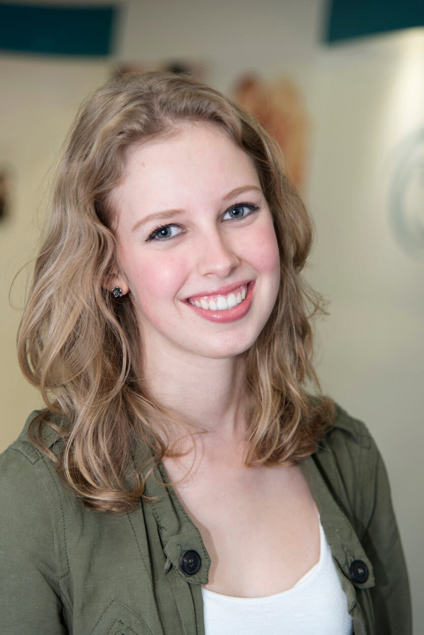
Fully proud and more genuinely ‘smiling with emotion’ rather than with ‘smiles’ is more the look I would aim for. Photo Credit - Ash Holdsworth
Technical Approach
In order for Leeds University to have a bigger and bolder approach to its photography and stand out from the rest, I’d like to suggest a process called composite photography. This is where a shot is established as a whole but each individual element is photographed separately within the frame. Every component is captured in its best light in a range of exposures, giving greater creative freedom in the edit, in order to produce an image which is instantly more polished, refined and eye catching to the viewer. The majority of modern advertising campaigns are photographed in this way and it also lends particularly well to Portraiture.
It can appear to be as simple as just a one light set up, however every part of the image has been considered, from the background to the foreground, the props, the furniture and of course the model. It’s not immediately obvious what is different about this kind of image, but the viewer can instantly recognise that there is something very attractive. It’s that intrigue and sense of wonder which helps photography be a respected art and separates the iPhone generation from professionals who continuously develop ways in which to hone their craft. The ultimate aim of photography to me is to transport the viewer into the photograph.
I’ve included some examples below.

Photo Credit - Erik Almas.

Photo Credit - JOSEPH SHIN

Photo Credit - Unknown

Photo Credit - blog.crismonphoto

Photo Credit - Erik Almas.

Photo Credit - Unknown
Like anything, Composite photography can be done simply or elaborately. Sometimes it can be over done and appear far too fake. If done well however, it can raise photography to a whole new level of quality. The lighting in the ‘Joseph Shin’ shot above of Ridley Scott appears to be just one simple fluorescent light bulb. However, he would have shot the background separately, the chair, the bulb itself and Ridley, all in the same frame but as separate images and different exposures for each component, later building up the layers in Photoshop. This gives him freedom over every aspect of the shot, creating his vision of what he wants it to be rather than just settling with what is there in front of you. It’s an artistic process not only in the photography itself but in the retouching. As every photograph is different, there’s no one process fits all - each element needs to be considered and balanced with each other, so the retouching style of composite photography changes from simply fixing an image to really becoming more like painting a picture.
I believe the Erik Almas shot (Above left) of the trumpet player in his study would be something very similar to the style I would go for for this story, only less Editorial and with a more direct message. It’s simple and instantly striking, with great tones and natural lighting, mixed with a little incandescent light in the background. It’s not overly contrived and has a classical feel to it. It appears to be a simple portrait, but has more presence than a standard shot - which is the composite photography element giving well balanced lighting.
As the library in Location 1. is a large area, I would approach it logically, step by step. Lighting an entire room as big as this can be done in several ways, but I would always start with the easiest set up and move up if I need to. The simple approach is seeing what available light is already there and then controlling it. I like to be as efficient as possible and communicative with the models. So rather than them hanging around and being brought on set all of a sudden with no idea of what’s going on, I prefer them to feel like they are a part of the whole process from start to finish. If it is a very complicated or time consuming shot this is not always possible of course, but I do like to work with them as much as possible as it helps to mellow any nerves and become more of a grounded and collaborative process.
The first thing I would do is set my camera up on a tripod and take a shot as is, so I know what I’m working with. I would start on an 85mm as it’s the most similar to the human eye when focussing on a mid level human figure. If that’s not possible I would try a 50mm and if we’re really limited I would try a 35mm. A lot of photography is a process of elimination.
It’s then a case of systematically addressing each component. Depending on whether we have the whole room to ourselves or not, I would ask the question of whether we have people in the background and if we could empty the room and position people where we need for a flattering placement. I would tidy up anything that stood out to me straight away, like furniture or books in unflattering positions. I light from back to front so if possible, I would turn all the house lights off and see where we stand with natural light to find an exposure to use as a core base. I would bring in the model to begin test shots and experiment with aperture - as depth of field is the next most important thing to establish, because it defines the focus of your shot, both literally and artistically. I like to shoot with a very shallow depth of field, usually around f/1.4, giving as much emphasis on the subject as possible and distance with the background. In this instance, starting wide, I would have the background at an optimum focus as well so not to waste its lines or beauty, finding balance between the two. Once I have my aperture set, all other settings work around it. As this is a perfectly symmetrical building, I would start there with my composition with the model dead centre and see how it feels. Sometimes it works and sometimes it doesn’t, so I would try different placements until it’s just right. Once I’ve found a good composition I would begin to bring in my studio lighting and build up the lighting on the model, fine tuning it as I go. Once I have my controlled lighting set up I would take shots in stages, finding a perfect background exposure that I can uses a plate shot just incase we can’t get everything lit in one shot. I would re-introduce the incandescent lights of the building and take a range of exposures as plate shots there so that I have control over their intensity and ambience in post-production and can ‘paint in’ what I feel is right for the whole shot. Once I am completely set up lighting wise, I would double check all elements including the background, props and people and tweak things until they’re right in the image. I would then begin the shoot proper with the model. The props I would use are things like classical literature books with obvious bindings, starting with the model holding them. If that comes across too cheesy, I would position them on a table close to her so they’re still a key element. I would at this stage take a number of shots in portrait and landscape (If required) and different angles, as interesting shots that you didn’t account for can sometimes appear once everything is set up. It’s not that I go on happy accidents, but sometimes these can be the best shots, so rather I like to create an environment and a set up in which allows for that to happen. My process is very controlled and precise, but not rigid at all. I think the best work comes from going with the flow. You can set up the most controlled environment ever, but it’s ultimately the present moment which creates the shot and that I think can only come from the connection between the photographer and subject and everyone else who’s there.
This sounds like a lengthy process but it is how I approach all photographic situations and I work within the time frame I have. It’s a natural process I go through which takes about 20-40 minutes for mosts et ups depending what’s going on. I like to be fast but deliberate in my set up so I can spend more time with the model capturing good photos! Photographing the model can vary depending on how well they photograph. I think being portrait photographer is 50% technical and 50% being a psychologist, so I like to create an easy atmosphere first so the final stage of shooting with the model just feels easy for them and me. It would usually take no more than 30 minutes. The process of photographing any composite elements after this could take anywhere between 20 minutes or a couple of hours. But If I’m happy with the model at this stage then I could I’d no longer need them on set and they’d be free to go.
Lighting
As for the specifics of the lighting, first and foremost I would have chatted with the art director in advance to find out what their desired look would be and done some tests. Lighting is perhaps the most important feature in any photo after the model, it can dramatically alter not just the look of the image, but the whole direction of what the picture is wanting to say. As humans we respond emotionally in a huge variety of ways to different forms of light, so I always try to establish what kind of lighting a client wants and offer different examples. As Leeds University has stated that they would like a fresh, bold new approach to their photography, it will be the main factor in everything.
If I was working independently to come up with a style myself I would propose the following;

Fig 1. Moonhive Healing - Ash Holdsworth
Firstly I would find a balance of daylight and incandescent light in the background to find the optimum level, so that the background is evenly lit, but not flat or dull but not burnt out either. This shot for ‘Moonhive Healing’ on the left (Fig 1.) is one of my own and the style is definitely too bright for what I would do in the library, but was right for this and demonstrates lighting a large and symmetrical space with ambient light as well as with models studio lit in the foreground. I would go a little darker and moodier for the library to keep in theme with the space, but not so dark that it’s menacing. I would try to find the dramatic nature of the building itself and capture the feel of the space, not too dissimilar to the shot in the brief (Fig 3.). I would accentuate the lighting and work with it to be more akin to the image on the below left ‘HOME Restaurant’ (Fig 2.), keeping it warm and inviting. Note that the client wanted the main background in this to be dark. It is not this precise lighting I am referring to but rather the balance of the lighting and mood of the shot.

Fig 2. Client didn’t want a bright background, but rather cosy and mysterious instead. Lighting on model is beauty lighting from a large soft box. House lightbulbs were shot at different exposures to get the correct feel for the shot and composited afterwards. HOME Restaurant - Ash holdsworth

Fig 3. Supplied Library image
Model lighting
The key to lighting is it’s softness. Lighting is everything so being able to have the time to use it to its limits and soften it as much as possible is a key factor in creating a high quality image. Lighting a person has become almost religious to me. This can take time so I usually get my model lighting tested and set up before they even arrive on set and then I micro adjust to fit their skin tone and face shape.
The foreground area of the library location looks a little flat as there isn’t much available light, so this is where I would get creative and invent it to match the style of the shot. My immediate thoughts would be to try a side lighting in the style of Rembrandt, which instantly adds drama and intrigue by creating light and shadow tones on a subjects face, and specifically a small triangle of light under the eye. It shows polarity, mystery and depth and invites the viewer toward the subjects eyes first. I would do this extremely softly so that the shadows are bounced back in and are only a slightly different tone to the ‘lit’ skin - if at all. My usual process is to try it first at an extreme angle; directly at the side and slightly raised, and then gradually bring the light around to create more of a beauty lighting and see what works best for the models natural features and mood of the shot.

Fig 4. This is Rembrandt lighting in it’s extreme. one direct light, no bounce. Accentuated shadows. Photo credit - Ash Holdsworth

Fig 7. Side Lighting - diffused and golden colour gelled. Photo credit - Ash Holdsworth

Fig 5. This is the same Rembrandt lighting but a little softer. One light, bounced from a wall on the left, with a reflector on the right hand side to bounce light back in and soften the shadows. Photo credit - Ash Holdsworth

Fig 6. Beauty lighting has a little more spread accentuating the natural shape of the face. The shadow here is darker than I would have as there is no bounce back from the right and I intentionally wanted it harsh in this shot.
Photo credit - Ash Holdsworth

Fig 8. Side Lighting - One light bounced off a wall on the left for the main light and then that same light bounced back in on the right hand side using a reflector to soften the shadows. Photo credit - Ash holdsworth
The quality of light is very important so I always diffuse where I can. Using bounced light rather than direct is my go to method if the space allows for it, as it’s instantly softened at the source, more than a soft box can do. I predominantly like to use one main light, as it’s easier to control. I can do a lot with it quickly and efficiently, keeping it very natural, rather than contending with multiple lights.
I would probably go with a lighting similar to Fig 5. and Fig 8. above for the case study, but perhaps a little brighter in the shadow area and less moody, but small adjustments can make a big difference.
The reason I would choose this style of lighting to begin with is that it is very ‘classical’. It is the preferred lighting style of the renaissance painters, chosen for its drama and intrigue and ability to pull in the viewer directly toward the subject - whether the shadows are darker or lighter, it still works the same way. I go with what works best for the person and style of the image the client is looking for and give the model enough physical space to not feel in the spotlight as it were and be themselves.
If this was approved, I would offer the suggestion to go on and add another bolder element - colour gels.
After seeing previous Leeds portraits around the campus and city centre, I was very happy to see some of the Art Direction examples you provided in the Brief. I already had it in my head to suggest a more modern twist with the lighting style to really stand out using the simple addition of colour. I was afraid this may have been too bold so it’s awesome to see that you are open to this and boldness is actually the ethos of the whole campaign. I certainly wouldn’t suggest it for everything and it should be used sparingly but, done in the right way I think it could work extremely well.
When a colour gel is added to an otherwise natural light it creates something non-organic and therefore a juxtaposition between something natural and something ‘modern’, ‘abstract’ or ‘man made’. This change of colour could either be applied to the main subject light (which in this case I think would be far too much), or it could be added as a simple highlight giving the subject a subtle halo effect but with colour rather than white light. From there you can also introduce subtle flares of colour for example, instantly energising a shot, but it’s not always necessary as you can also go overboard with it. Even just a standard flare can add a lot to an image.
Lifestyle photography is usually all back lit and intentional light flares are sometimes used also. It’s a style often adopted by photographers (or companies) chosen for it’s ability to instantly emotionally connect with the viewer and give them a positive feeling of bright feel good sunshine first and transport them into their own version of the image, whether via memory or fulfilling a future ambition. Thus (which is perhaps sometimes morally questionable) influencing them to invest in what the image is advertising.

Fig 9. Photo Credit - Ash Holdsworth

Fig 10. Photo Credit - Ash Holdsworth
This colour aspect would be a deliberate choice because up until this point we have just created a classic, well lit photograph. It would fit in with all the previous material of Leeds University. Normally I would tie in to an organisations established look and not venture too far out of it. However, as we have the rare opportunity to start from scratch with an entirely new focus, I would bring up the question of whether we would want to go a little more abstract and really establish a new and dynamic ‘LU look’ for the new material - still in keeping with a soft and classical, elegant style, but with the aim of blending the Universities rich and established history, with modern day students, and thus attracting a fresher way of thinking and appealing to a current generation.

Fig 11. Orange gelled side light, with pink gelled soft highlight. Photo credit - Ash Holdsworth

Fig 13. Natural side light with pink gelled harsh highlight. Photo credit - Ash Holdsworth

Fig 14. Natural top-front light with pink gelled harsh highlight. Photo credit - Ash Holdsworth

Fig 16. Diffused soft box from left, colour gelled and honeycombed orange highlight from back right. Photo Credit - Ash Holdsworth

Fig 12. Blue gelled main and background light front top, diffused green gelled side main light from right, pink gelled highlight from back left. Photo Credit - Ash Holdsworth

Fig 15. Pink ‘Shadow’ light to fill the room bottom front, overpowered by a yellow key light from left, yellow background light and slight blue main light from back right. Photo Credit - Ash Holdsworth
The above and left images of mostly musicians are all elaborate examples of colour gels being used to match the style of the artists music or create an atmosphere, but if used subtly a coloured highlight can add a lot of uniqueness to an image. It can be done in keeping with a photo’s natural colouring, in the case of Location 1. using either an orange hue to compliment the lower lighting in the building and the richness of the wooden bookcases, or a slight green hued highlight to match with the colour cast of the chandeliers. This could be made to feel very natural, or exaggerated in colour to give a hyperreal feeling. Either way I would suggest a soft highlight over a harsh one.
Alternatively you can sometimes use a particular colour of light which is not found anywhere else in the image and therefore really makes the subject stand out. It can look really wrong or really right. In Fig 14. above, having a very standard portrait set up with the minimalism of the grey background, muted tones of the bands outfits and evenly lit natural colour main light - by then adding a tiny bit of bright pink helps add a very simple but effective twist to the image. It takes a fairly boring band shot and adds a little something to make them stand out and hint at their sound. If you were going really bold in your marketing you could add a ‘red’ highlight to an otherwise normal looking shot as a nod towards Leeds University’s branding colours. I don’t think it would work with this image for the brief but is maybe something to think about for studio style portraits.
When mixing lighting, the choice of colour is important in complimenting the opposing colours already in the image. I sometimes do this using lighting or when I treat an image in post production to match a company’s branding colours for example. The below image (Fig 17.) was specifically chosen to do at ‘golden hour’ to get the natural warm light of the sunset, and styled with the orange smoke bombs and body paint, all to tie in with Tropic Nations Logo so that it looks uniform in the advertising images and across their social media pages.

Fig 17. Tropic Nation - Advertisement for Tropic Jungle Sport & Music Festival. Photo credit - Ash Holdsworth
I also use this technique when no studio flash or set up time is available at their events, by creating a unique colour treatment profile within the pixels themselves - this process was all developed with the client.

Fig 18. Notice backlit ‘tropical’ lighting (from the sun) and orange mid tones in the colour treatment of the image matching their logo in above image (12.). Photo credit - Ash Holdsworth

Fig 19. Orange mid tones in the colour treatment of the image. Photo credit - Ash Holdsworth
I did a series of portraits of friends in their place of work where the theme was ‘why do you get up and do what you do everyday?’ to highlight people’s passion for their craft. I deliberately wanted to keep the background darker and more desaturated than the subject in all the imagery, and then light the person with a similar feel of what was already there. I did this purposely to show that a persons job is nothing without the person, so I wanted to highlight the human in the environment and also how the job itself influences a person to do what they do everyday.
In the shot below of my friend Giusseppe (Fig 21.) who is a head chef of a major restaurant, I lit him using a golden colour gel on the left to replicate the heat lamps used to keep the food warm, with a subtle white light on a right highlight to replicate the soft incandescent lighting above. I went with the lighting that was already there, but as it was not bright enough to take a high quality picture I replicated and exaggerated it with studio flash, giving more control and allowing me to shoot at an acceptable ISO range so the image is not grainy but crystal clear. I also developed a colour treatment with blues in the shadows and orange in the mid tones to exaggerate it even further. Not only do teal and orange compliment each other, but I also wanted to give the feeling of what it’s like to be in a commercial kitchen with blue gas flames, stainless steel and heat everywhere. So this is a good example of how you can use lighting and colour to create an interesting feel, while staying natural to what is already there.
If I can light and capture everything in one shot then that is the goal, but if I need to capture a different exposure for the background and foreground, then it’s just a case of keeping the camera on a tripod and asking the model to step out for one shot so I can capture it in its entirety and not covered up by anything and comp it together in post.

Fig 20. Giuseppe Romano, Head Chef. Photo credit - Ash Holdsworth
In the shot below of Tashi (Fig 21.), which I featured in Question 1, I replicated the overhead fluorescent tubes of the room using a soft box, at a slightly different angle to make it more flattering. I had a diffused highlight behind her to replicate the light from the curtained window. As well as having a darker background than usual in all these shots, I also had a consistent composition throughout the series.

Fig 21. Tashi Brown, Embalmer. Photo credit - Ash Holdsworth
This process of colour matching, exaggerating colour or composite work all sounds very elaborate but it can easily be done in an hour or two depending on the location. I never go into a shoot with the exact process in mind, only the finished image in my head. So I will always adapt to the situation, doing what it is possible with the time and space.
The whole process I’ve described is to give a polished look and make the photography stand out - rather than just a simple one exposure image using available light and just sticking a soft box on a model and playing around in photoshop. I’ve worked independently in both photography and retouching from the start of my career because I think each makes you better at the other. I think there’s a few factors involved in advertising portraiture, the main one being to translate someones ideas from a brief into an image as well as the dynamic range of a camera, the quality of light and the time spent on creating a solid photograph both on the day and in post is what I think separates a good photo from a really good photo and makes an image everyone can be proud of.
Sometimes a one shot image using available light can be just as striking without any composite work or minimal retouching work but my theory is; if we have time to have more control over the lighting and finished product then we can produce something more aligned to what the human eye sees - which is what we’re always aiming for in photography. Human eyes don’t see in just a one snap shot exposure - but rather we scan an entire environment all at once giving a ‘higher dynamic range’ of tones, going from the darkest blacks to the lightest whites - and all the colours and tones in between. Shooting in this way makes you feel more like you are there.
Timing
The Estrella shot below was achieved using the process I’ve described above from start to finish. Estrella like their images to be very bright and clear, but not burnt out. I took a number of various scenes that day and I had limited time with the model so and to work quickly, but this individual image probably took about 40 minutes all up, including setting up the lighting from scratch, the laptop and camera equipment, testing and adjusting, to photographing the background and windows as separate plate shots, capturing a number of expressions with the model, to shooting the final shot.

Fig 22. Photo Credit - Ash Holdsworth
Post Production
For post production it’s hard to predict timing as it varies from project to project. For high end portraiture shoots my preferred method is to shoot tethered which means shooting direct to the laptop on the day of the shoot, so the images are already there for me to start working on either the same day post-shoot or the following day so as well as having a more quality focused shoot on the day, there’s zero import time afterwards which can be a lengthy process. It usually takes me about half a day to go through a set of images and get them ready for processing. For multiple images it can be anything from half a day to 2 or 3 days. If it was just the one image we were working on, it would be less; 2-3 hours. I go through and get rid of any duds, select the heroes, adjust all exposure and colour levels, fix things like lens distortion, noise, develop a unique colour treatment and process them. At this stage if we have had time for the client to go through and select the hero shots on the day of the shoot then I can start retouching. If not then I output all the potentials as low res jpgs and send them to the client for selection and approval. Once I have the final chosen image/s I then output them once again as high resolution TIFFs so I have nice large files to work with, and begin to comp all the elements together. I fine tune everything else by hand in photoshop, fixing any skin blemishes, hair, enhancing eyes, teeth cleaning, tidying up the background, fixing any colour issues and addressing any off angles or lines in the shot and finalising the light levels and clarity of the image. When I’m done here I save finished images as both high and low res jpgs for print and online use to send to the client.
I do all my retouching myself unless requested otherwise. The image above (Fig 22.) was relatively straight forward and would have taken me probably half a day to process and then 2-4 hours to retouch, some can go faster and some slower, but I generally like to leave 1-2 days to work on an important image or set of images.
Images are usually completely finished 1-2 days after the shoot, depending on the volume of shots or how busy I am shooting/retouching that week. I always discuss timings with the client beforehand so the images can be promptly delivered on time.
Final Shot
I‘m unable to find a direct comparison as an example of what the finished product I intend, would look like (which is probably a good thing) but I believe the tonality of the image below (Fig 23.) would be something similar, but obviously not fashion and with a completely different expression, message, composition etc. and I’ve re-inserted the Erik Almas shot (Fig 24.) as it’s probably the closest I can find to an overall balanced shot.

Fig 23. Photo Credit - Unknown

Fig 24. Photo credit - Erik Almas
Ultimately I love creating unique work, through collaboration with equally driven people, that works for an individual and specific purpose. I believe this process gives the best results, and so through the methods outlined here (along with a bit of hard work) would confidently achieve the new direction the University of Leeds is looking for.